Case Study 01 · Banking
Onboarding at NAB.
Mobile self-serve and banker-assisted onboarding, redesigned as one journey, inside Royal Commission, AML/CTF and KYC constraints.
What Changed
2%12%
Onboarding conversion on iPhone, up six-fold. Customer research and heuristic analysis found where people fell out; rapid prototyping fixed it.
First product to ship on NAB's customised Material library, now reused across ten core platforms.
3
Regulatory frameworks designed within, not around: Royal Commission, AML/CTF and KYC obligations.
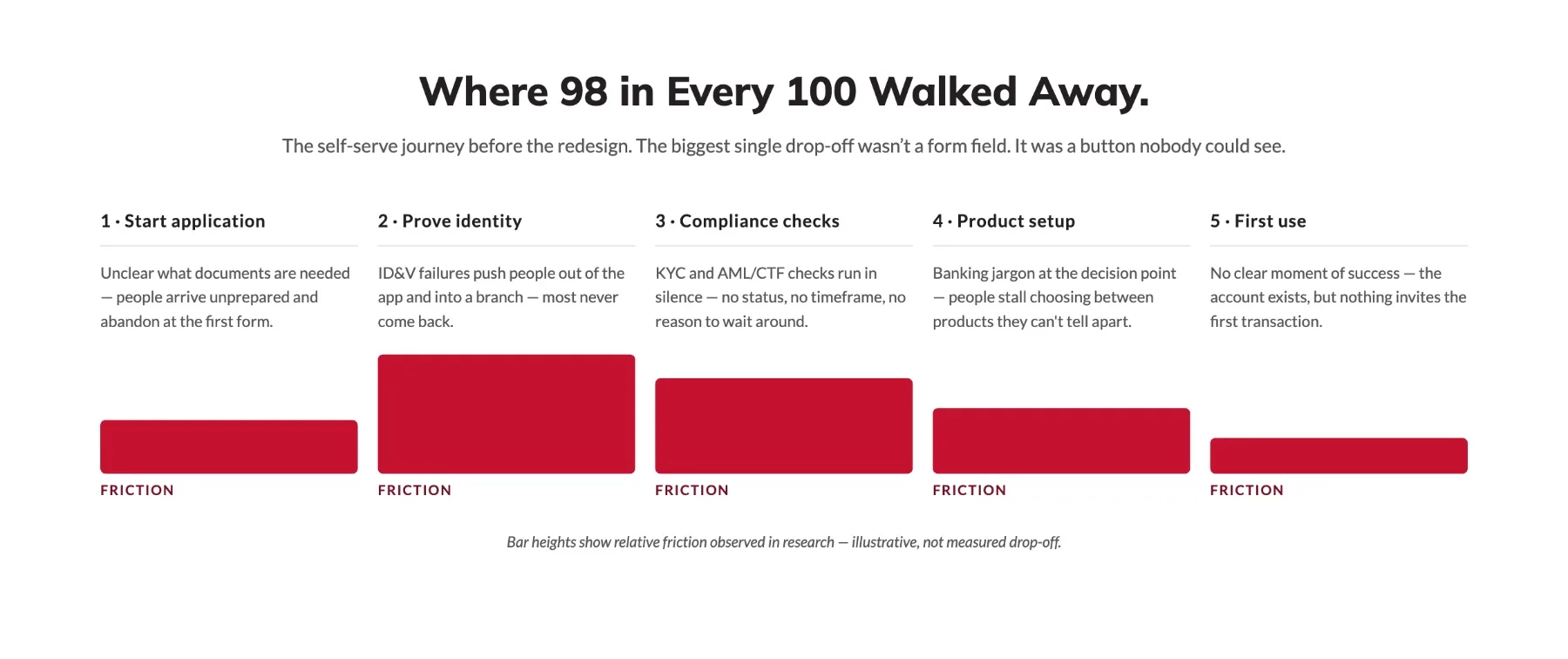
Where 98 in Every 100 Walked Away.
The self-serve journey before the redesign. The biggest single drop-off wasn't a form field. It was a button nobody could see.
Act I · The Diagnosis
Ninety-Eight in a Hundred Walked Away From a Button They Couldn't See.
Two full-width buttons, stacked. Login on top, Join NAB underneath, and on smaller handsets, Join NAB sat below the fold. The single most important action in the funnel was invisible to the people who needed it most: the ones who weren't customers yet. The fix was almost insultingly small: demote it to a text link so both fitted above the fold. Conversion on Android moved from 2% to 4% immediately. The iOS release didn't ship until the following year; that was mine, and it went to 12%.
Welcome. Let's get you into your money.
The 2022 welcome screen, reconstructed. Switch versions to move the join action: demoted to a text link, it fits above the fold on every handset.
One of four designers on the programme; I led iOS delivery. Screens reconstructed from 2022–23 designs. No customer data shown.
Act II · The Rule
So I Made It Impossible to Happen Again.
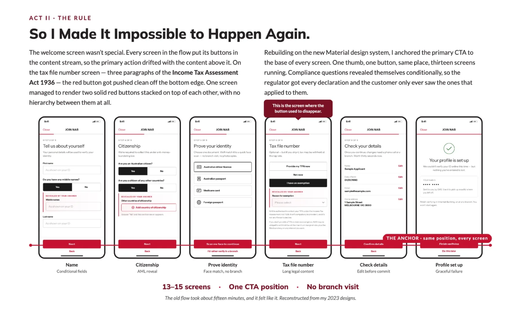
The welcome screen wasn't special. Every screen in the flow put its buttons in the content stream, so the primary action drifted with the content above it. On the tax file number screen (three paragraphs of the Income Tax Assessment Act 1936) the red button got pushed clean off the bottom edge.
Rebuilding on the new Material design system, I anchored the primary CTA to the base of every screen. One thumb, one button, same place, thirteen screens running. Compliance questions revealed themselves conditionally, so the regulator got every declaration and the customer only ever saw the ones that applied to them.
Three Tests Every Decision Had to Pass.
Customer, compliance and efficiency: every call had to clear all three.
Customer
Delighting the customer
Tackling pain points, lifting CX, a single customer view and digital identity: the experience had to earn its place.
Does it earn its place on the screen?
Compliance
Keeping customer and bank safe
Combating financial crime, preventing money laundering and meeting KYC and CDD obligations, inside the design rather than bolted on.
Is the AML/CTF obligation met in full?
Efficiency
Modular, reusable services
Fewer manual processes, fewer remediation cases, lower tech and change costs: one design system, fixed once and reused.
Does the fix land once, everywhere?
How the Work Got Done.
- ResearchCustomer research to find where 98 in every 100 people walked away.
- DiagnoseHeuristic analysis of the self-serve and banker-assisted paths.
- PrototypeRapid prototyping across both onboarding paths.
- MapEnd-to-end journeys against every compliance checkpoint.
- SystematiseA customised Material library so fixes shipped once, landed everywhere.
Reflection
The constraint wasn't the enemy. Designinginsidethe rules is what made it ship.
Still here? You're my kind of reader. There's more below.