Fair Work Commission.
Sole designer on a new national service portal that 50,000 people a year rely on.
Australia's Workplace Umpire.
The Fair Work Commission is the national workplace relations tribunal, administering the Fair Work Act, setting minimum employment standards, resolving disputes and approving enterprise agreements for millions of workers and businesses.
What One Designer Shipped.
Ship the Portal.
How Might We Develop a Responsive, Accessible Service Portal for Users Seeking Critical Info?
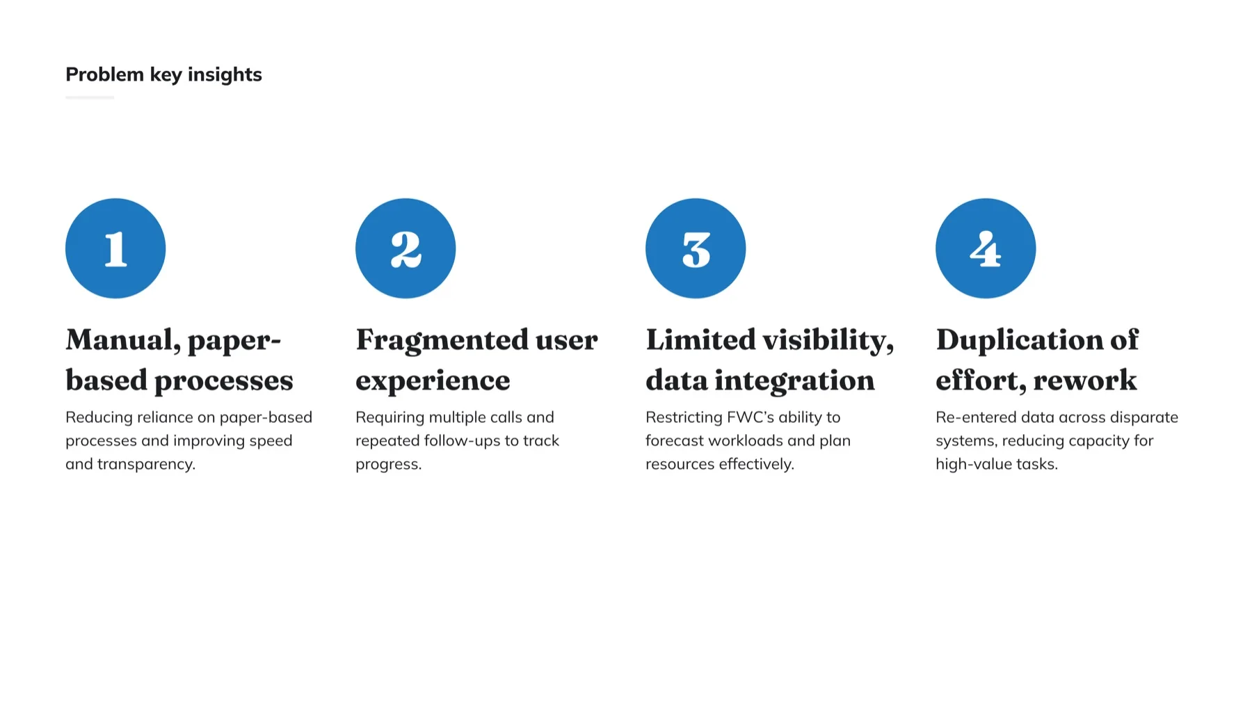
A first-time applicant downloads, prints and posts the form; staff re-key it by hand. Everything starts slow.
Standing on Prior Research, Then Pressure-Testing It.
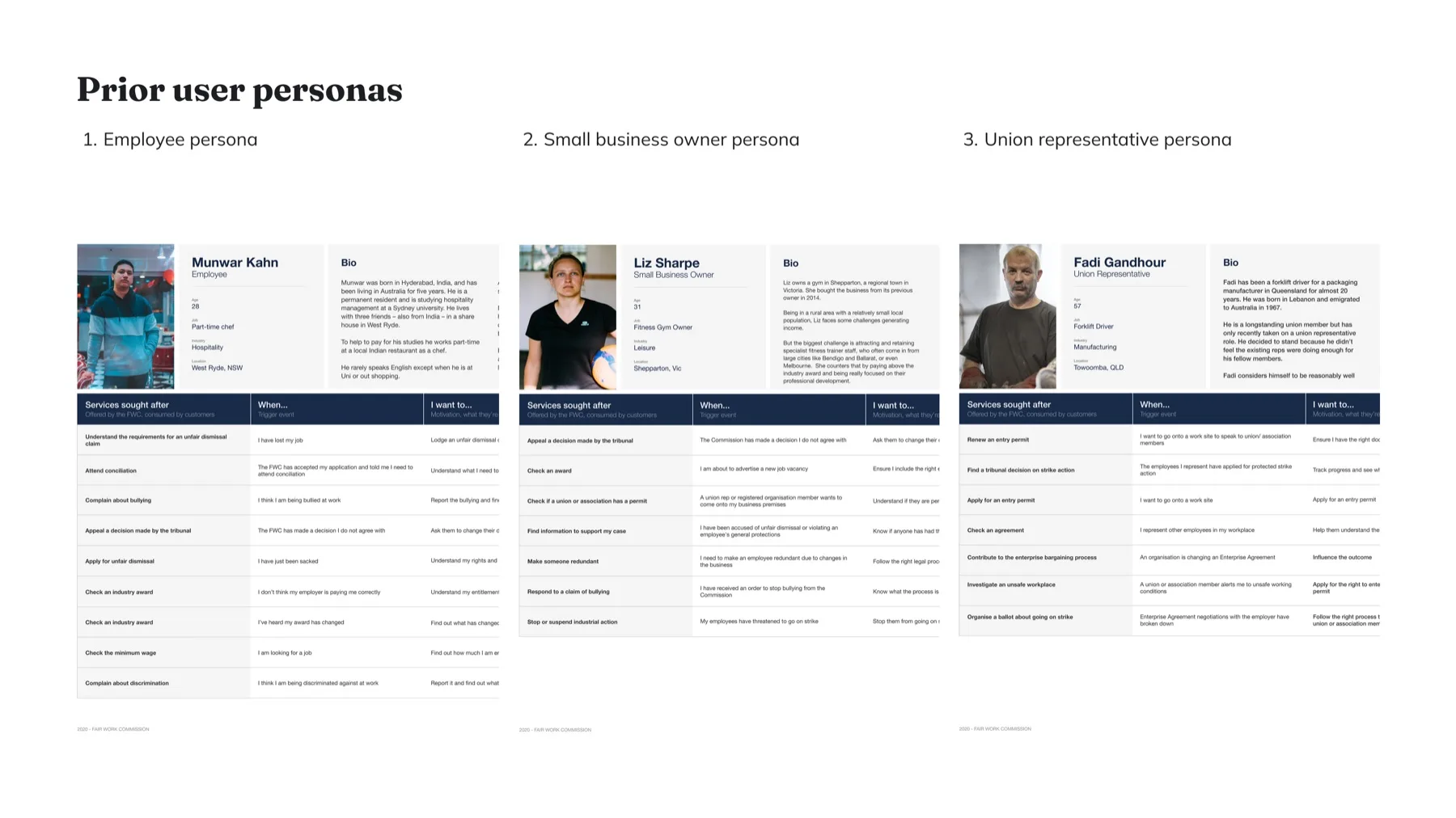
The Commission's 2020 personas and journey maps (employee, small business owner and union representative) were the starting evidence for who the portal serves and where the old journeys broke down.
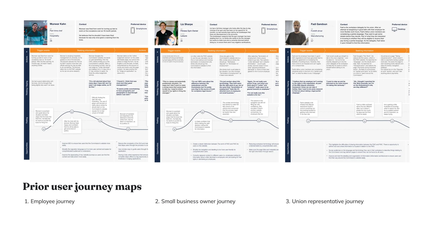
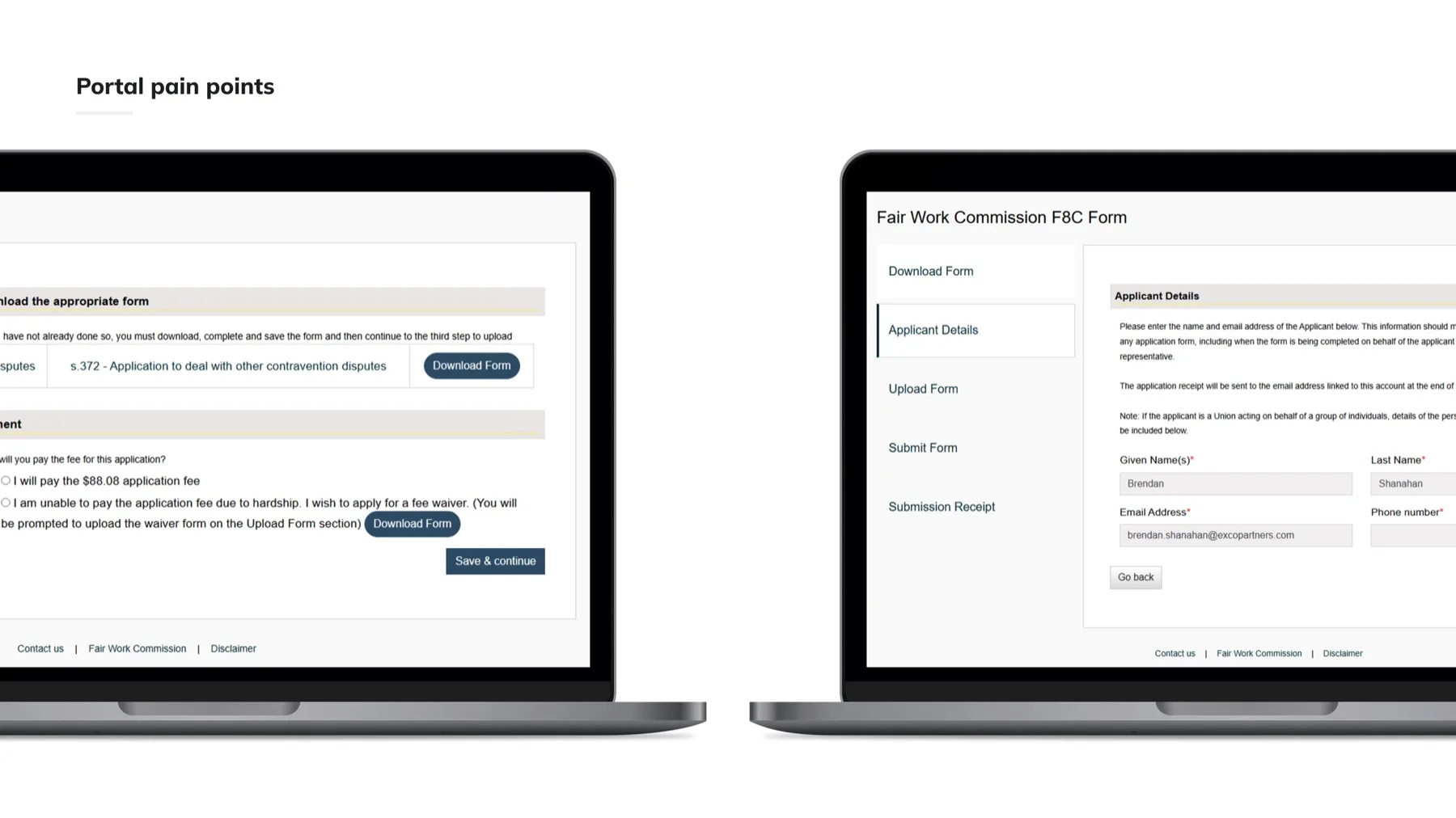
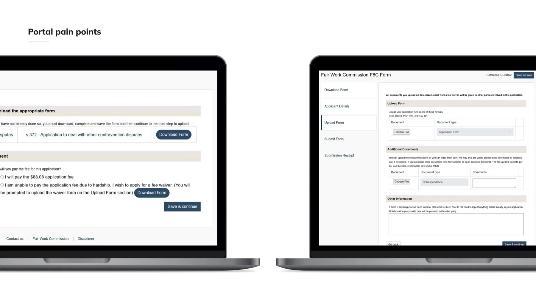
A Legal Process at a Stressful Moment, Split Across Downloads, Uploads and Disconnected Screens.
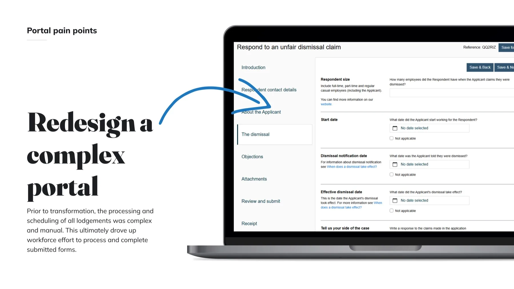
The legacy Online Lodgment Service asked applicants to download a form, fill it offline, then return to upload it, with fees, waivers and attachments handled on separate screens. Processing and scheduling was manual, driving up workforce effort behind the scenes.
One Map of the Whole Service.
The new portal's information architecture: login and account creation, dashboard, lodgments and forms, with the navigation, right-hand help panel and notifications mapped screen by screen.
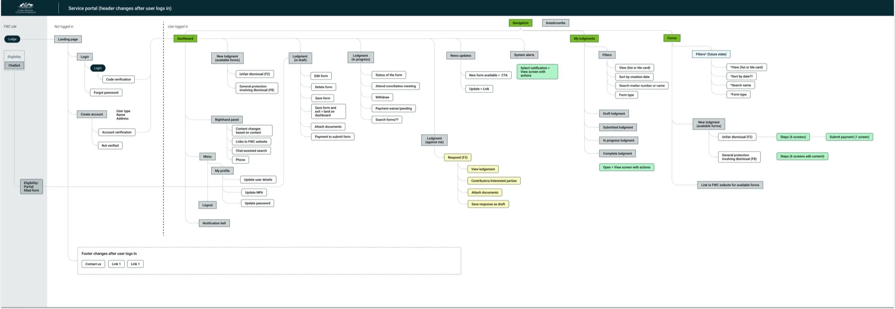
In text: the portal branches from a landing page and login into a dashboard, then into lodgments, forms and a profile area, with global navigation, a right-hand help panel and notifications carried across every screen.
One Front Door for Everyone in a Workplace Dispute.
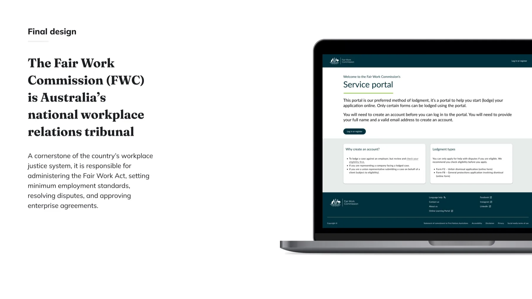
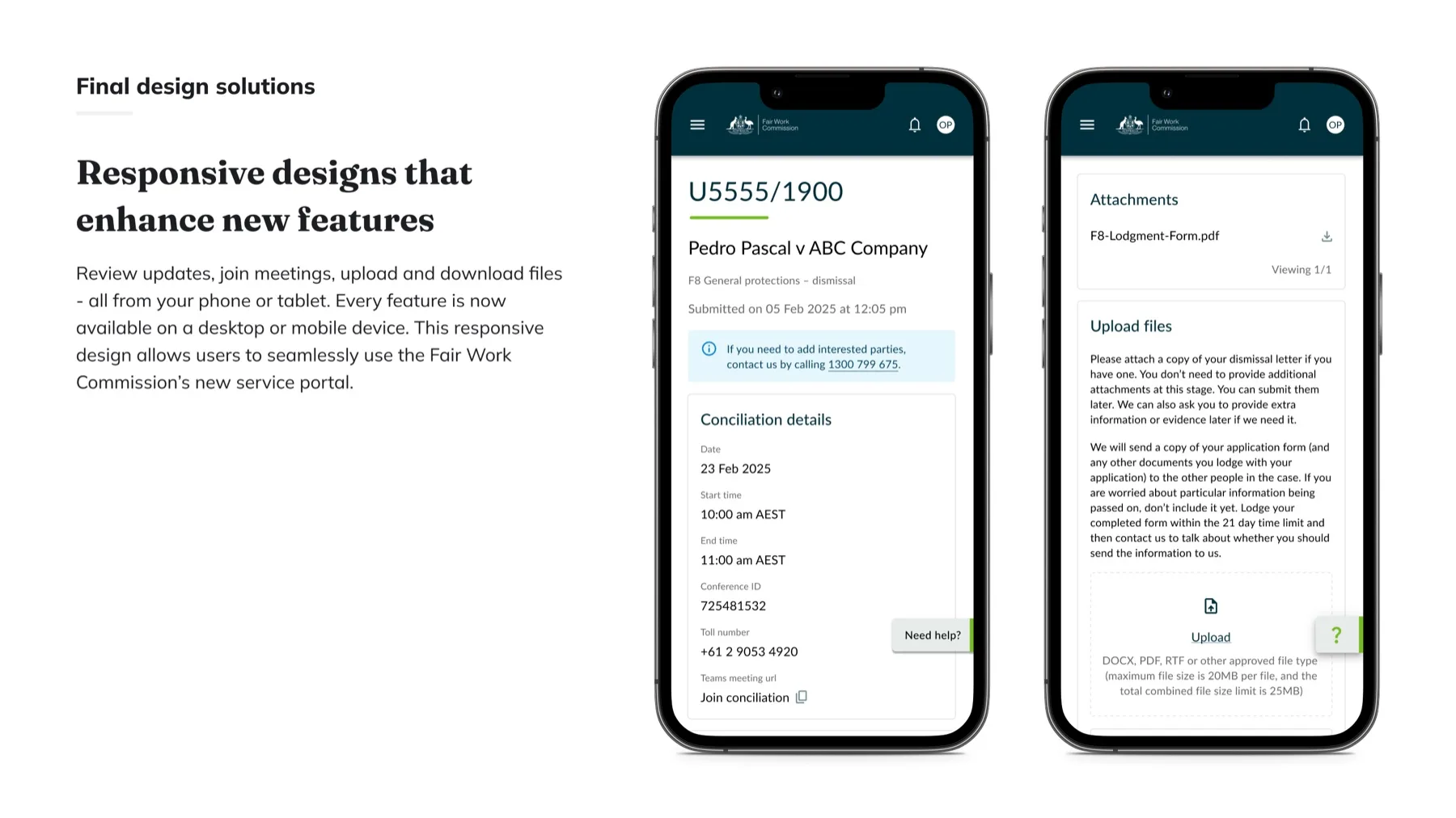
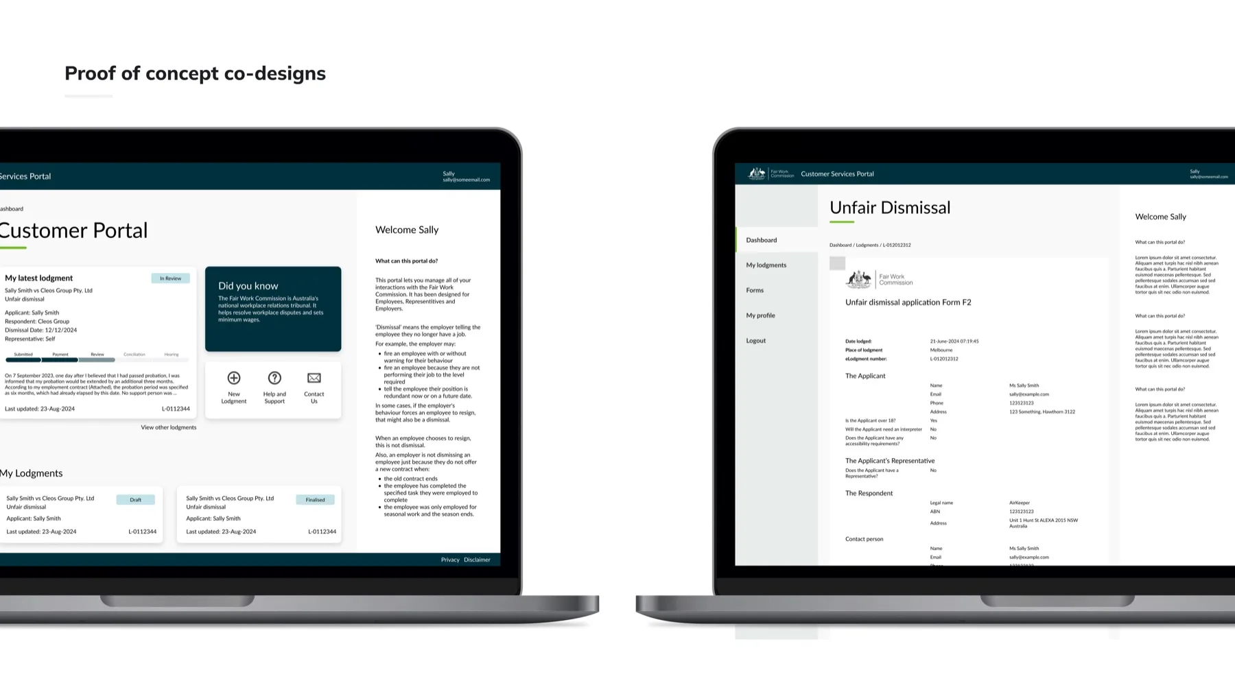
Claimants, respondents and representatives can draft forms, lodge applications and track progress on any device, without the paper. Designed end to end by one designer: research, journeys, high-fidelity UI and accessibility documentation at every step.
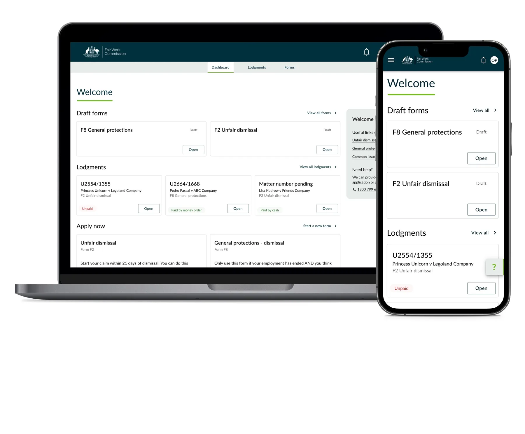
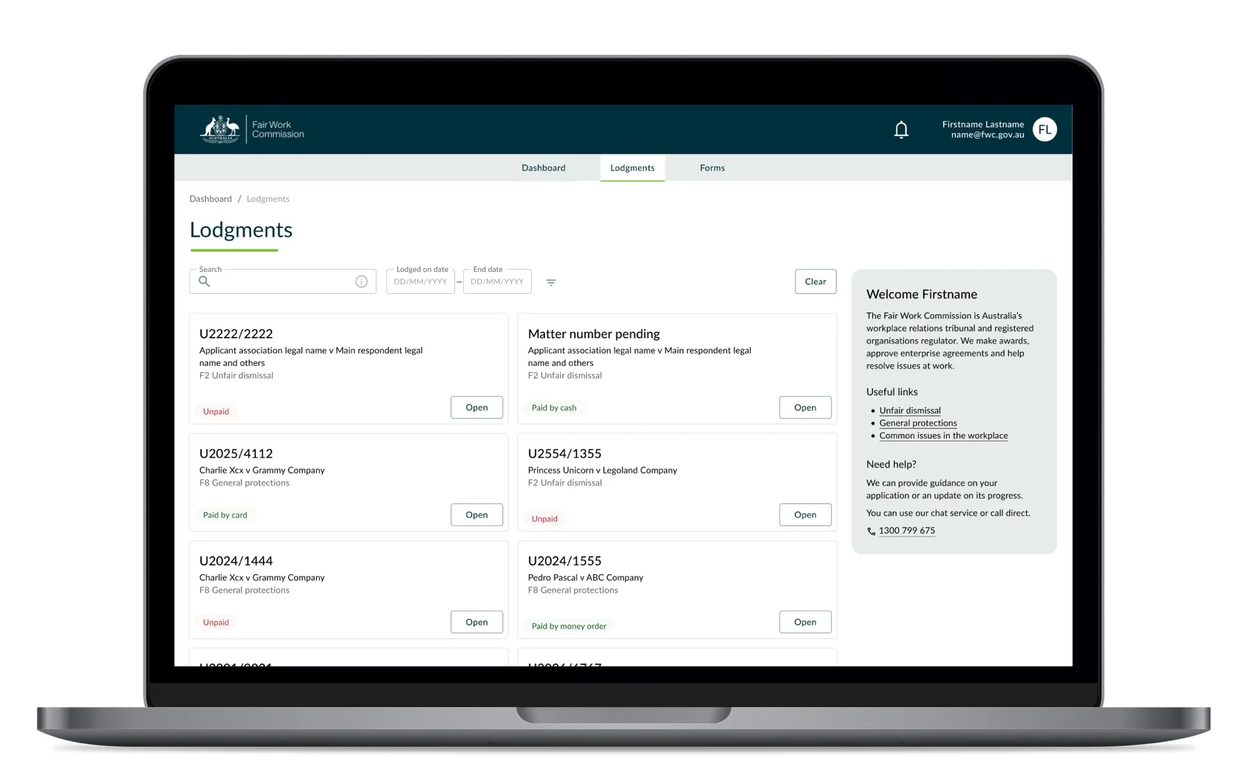
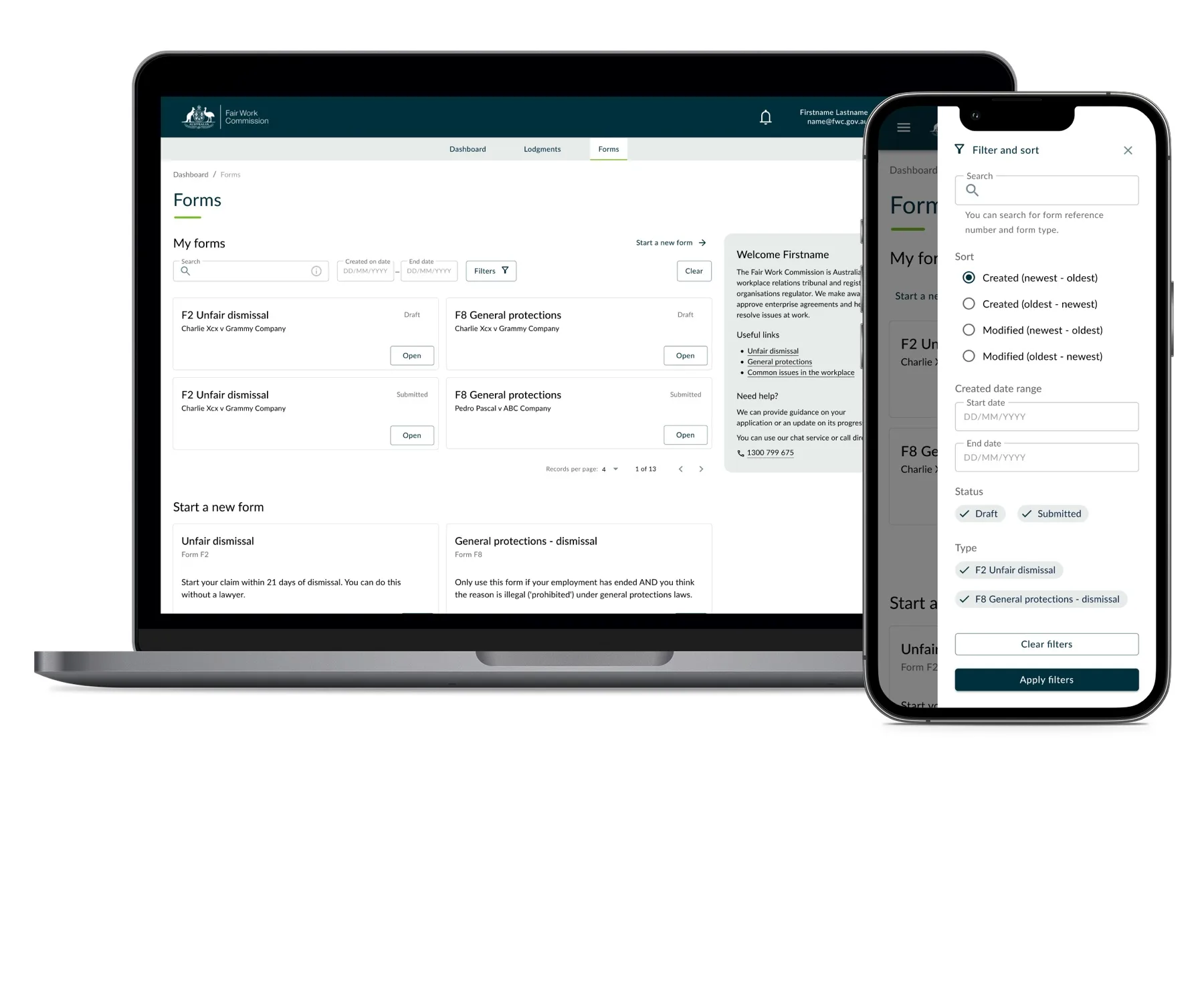
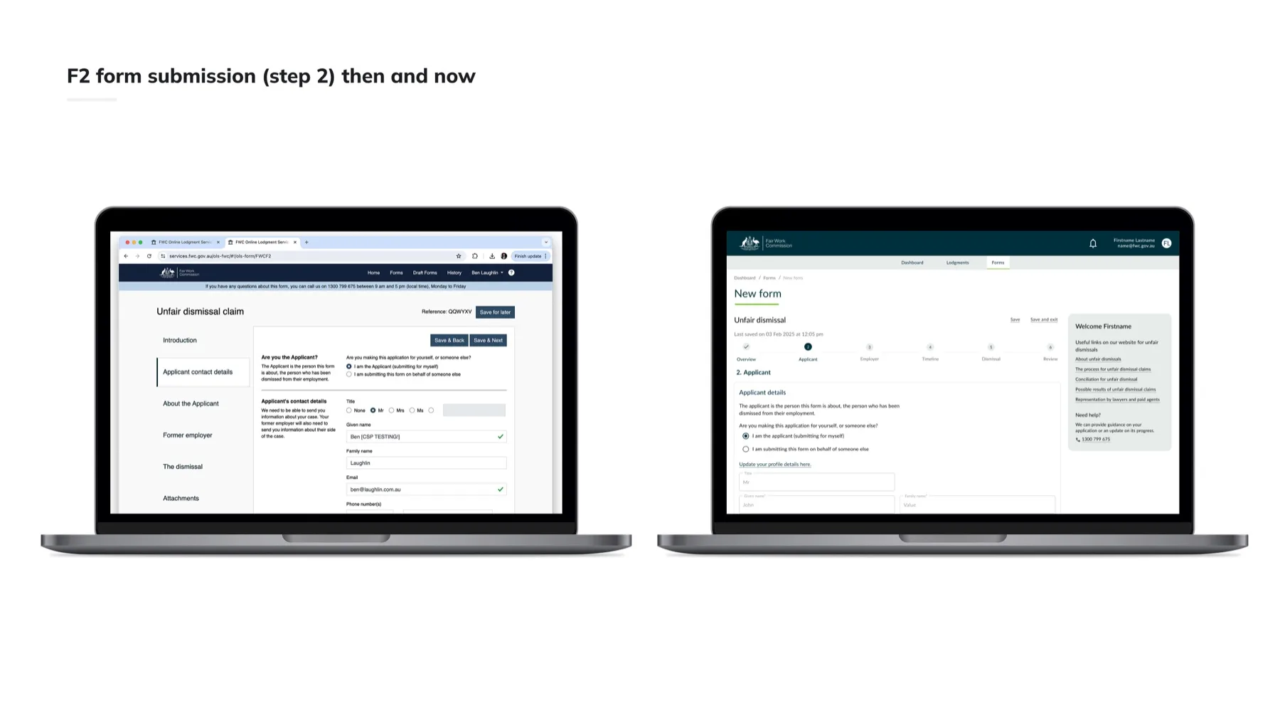
Four Fixes, Annotated on the Shipped Screens.
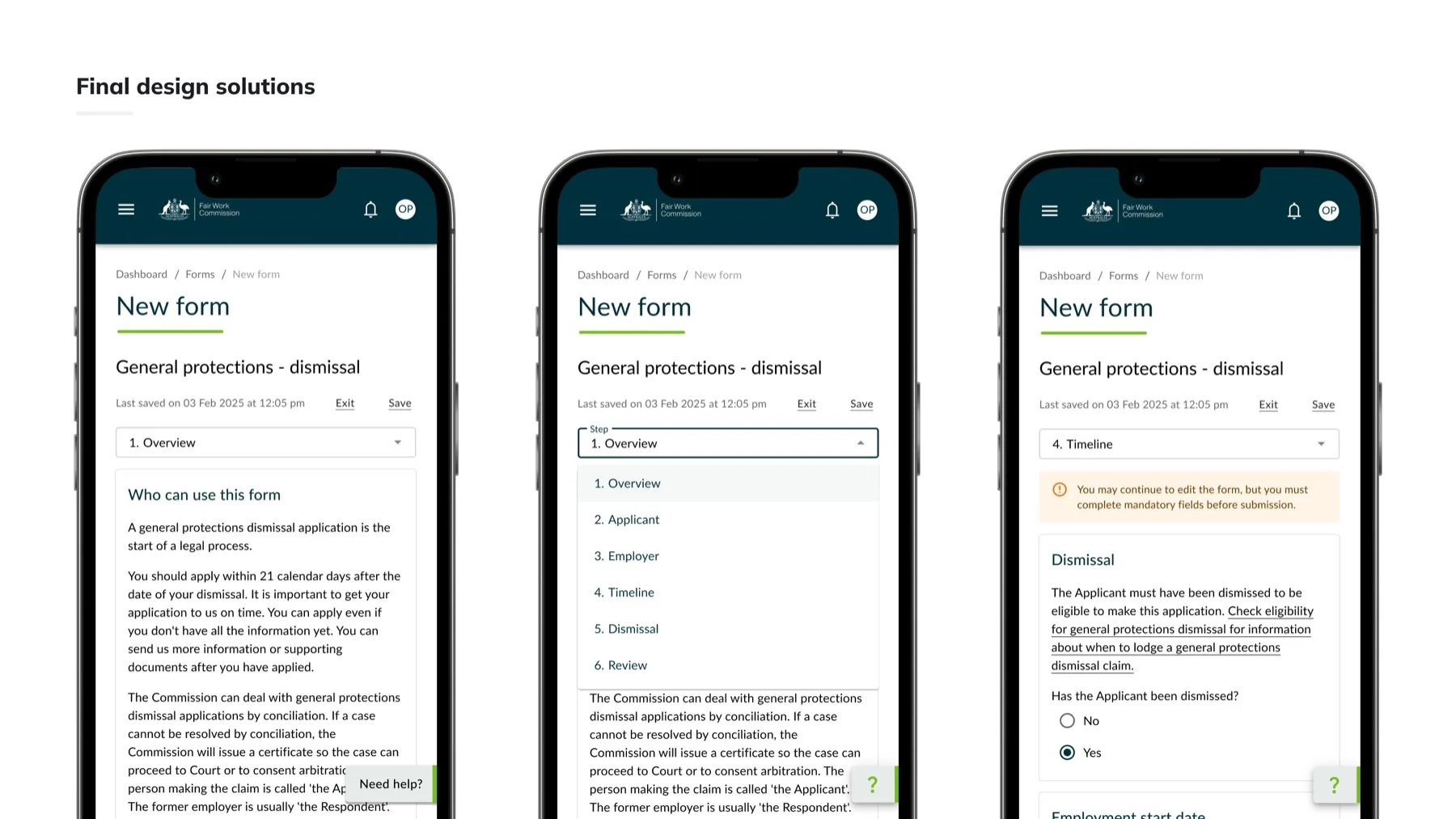
Usable navigation, status clarity, a clean interface and accessible support. Each fix visible in the final UI, from the desktop view-form screen to the six-step mobile form flow.
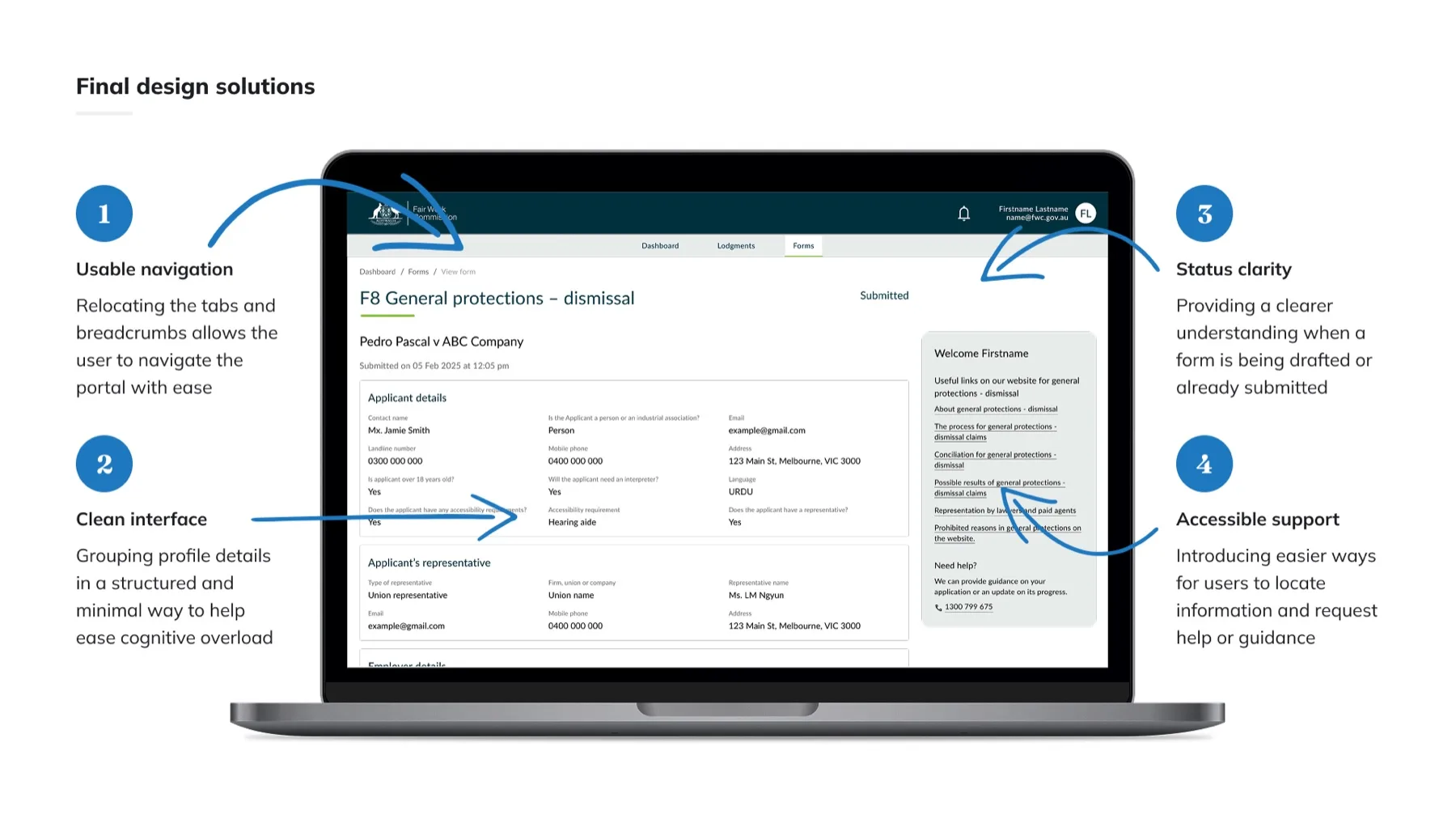
Tabs and breadcrumbs relocated so people can move through the portal with ease.
Hover, focus or tap a marker to explore each fix.A clean rebuild of the shipped F8 view-form screen. The four fixes are interactive markers, not baked-in labels.
Designed in Sprints, Supported After Launch.
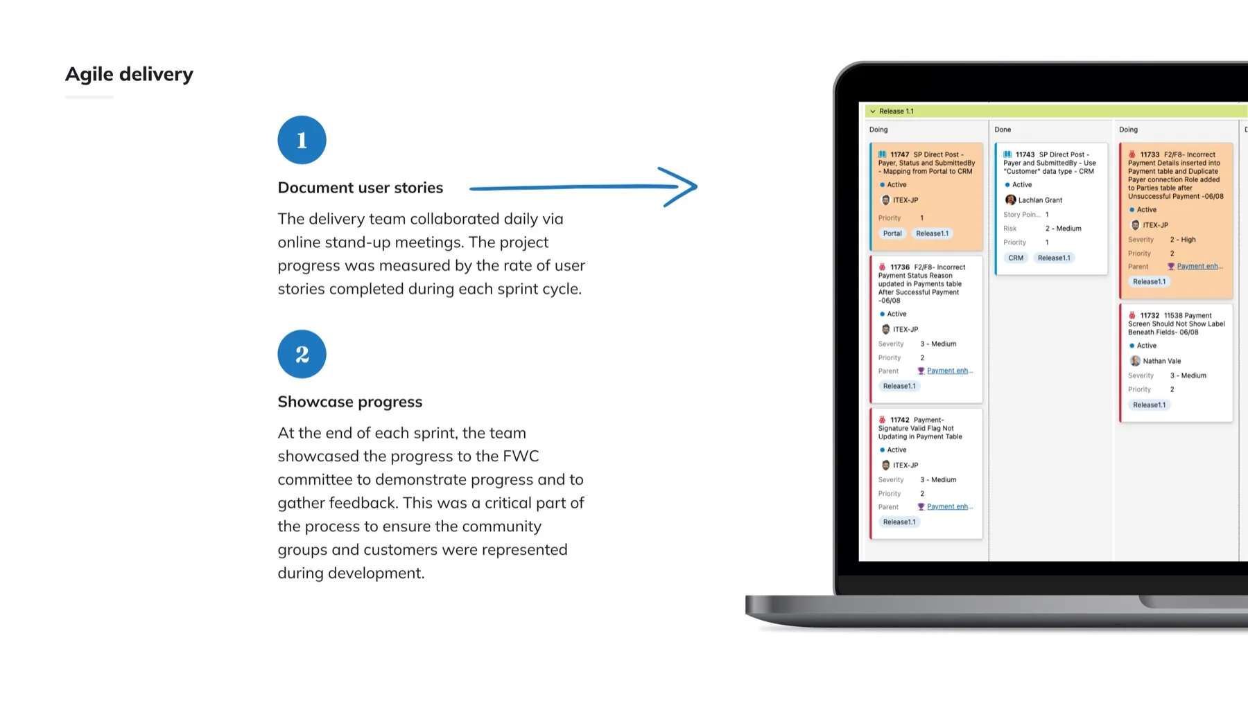
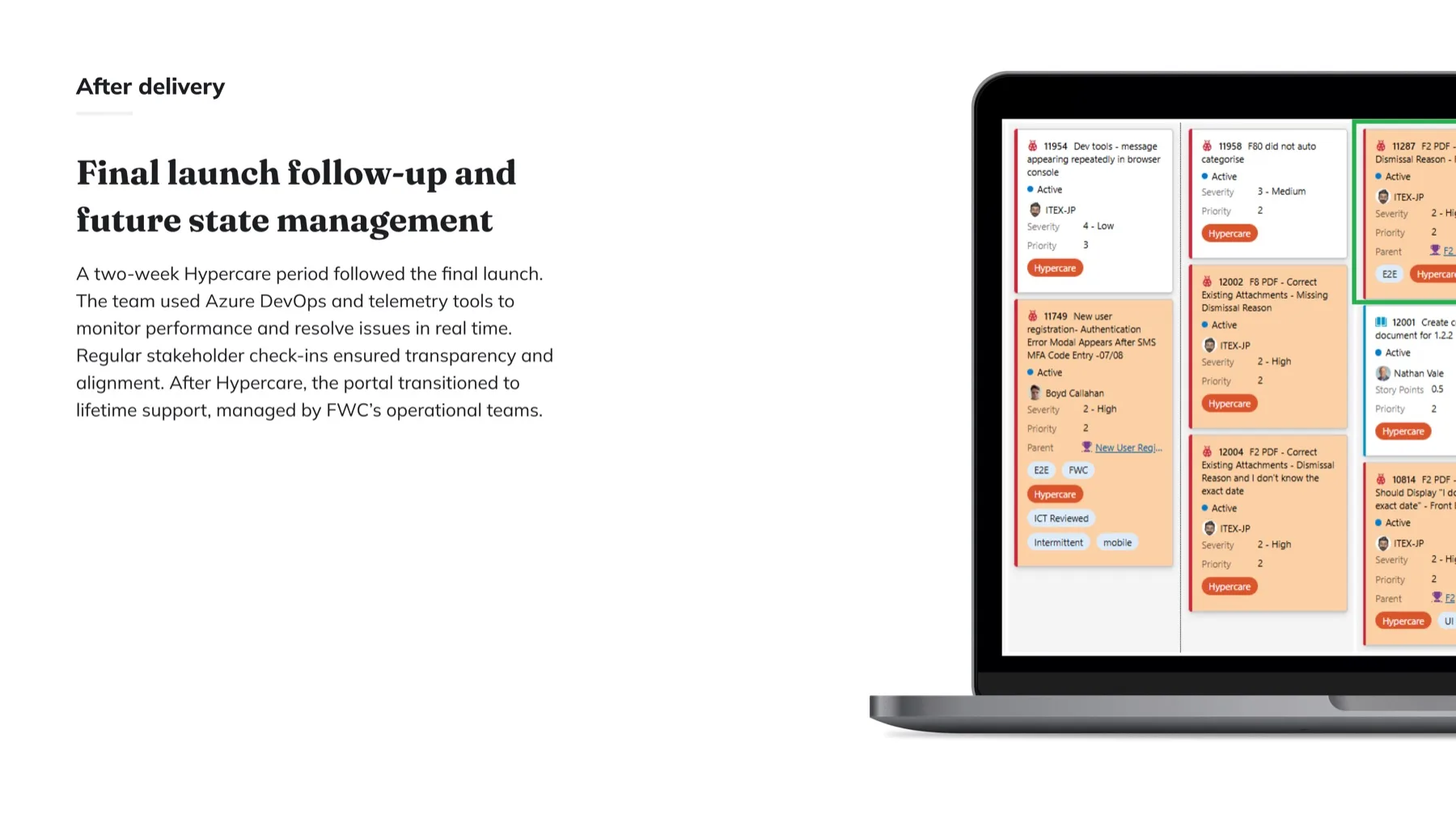
Daily stand-ups, user stories per sprint, showcases to the FWC committee, then a two-week Hypercare period with Azure DevOps and telemetry before handover to the Commission's operational teams.
Then the Results Came In.
MyFWC portal user survey, 18–24 August 2025, the first pulse taken after launch.
Redesign the Service Behind It.
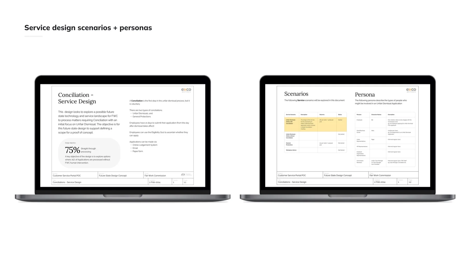
The portal is what the public sees. Behind it sat a conciliation service run on hand-offs, so the second half of the engagement redesigned the service itself, with a design objective of 75% straight-through processing.
Start With Who's in the Room, and What "Resolved" Means for Each.
Service scenarios and personas for unfair dismissal conciliation (applicants, respondents, case managers and conciliators) defined the future-state concept and scoped the proof of concept.
From Fragmented to Connected.
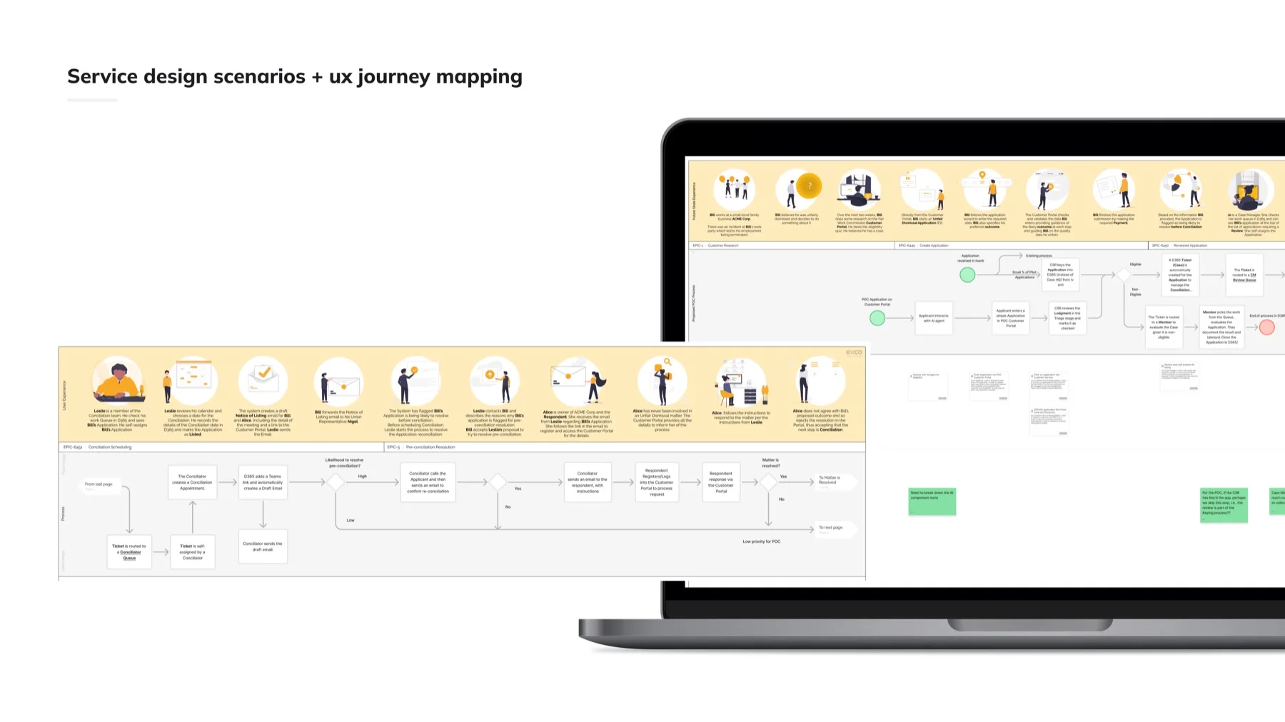
Story one shipped the portal the public sees. This is the service behind it: the same matter, from intake to resolution, rebuilt so the manual hand-offs that slowed everything down become connected steps.
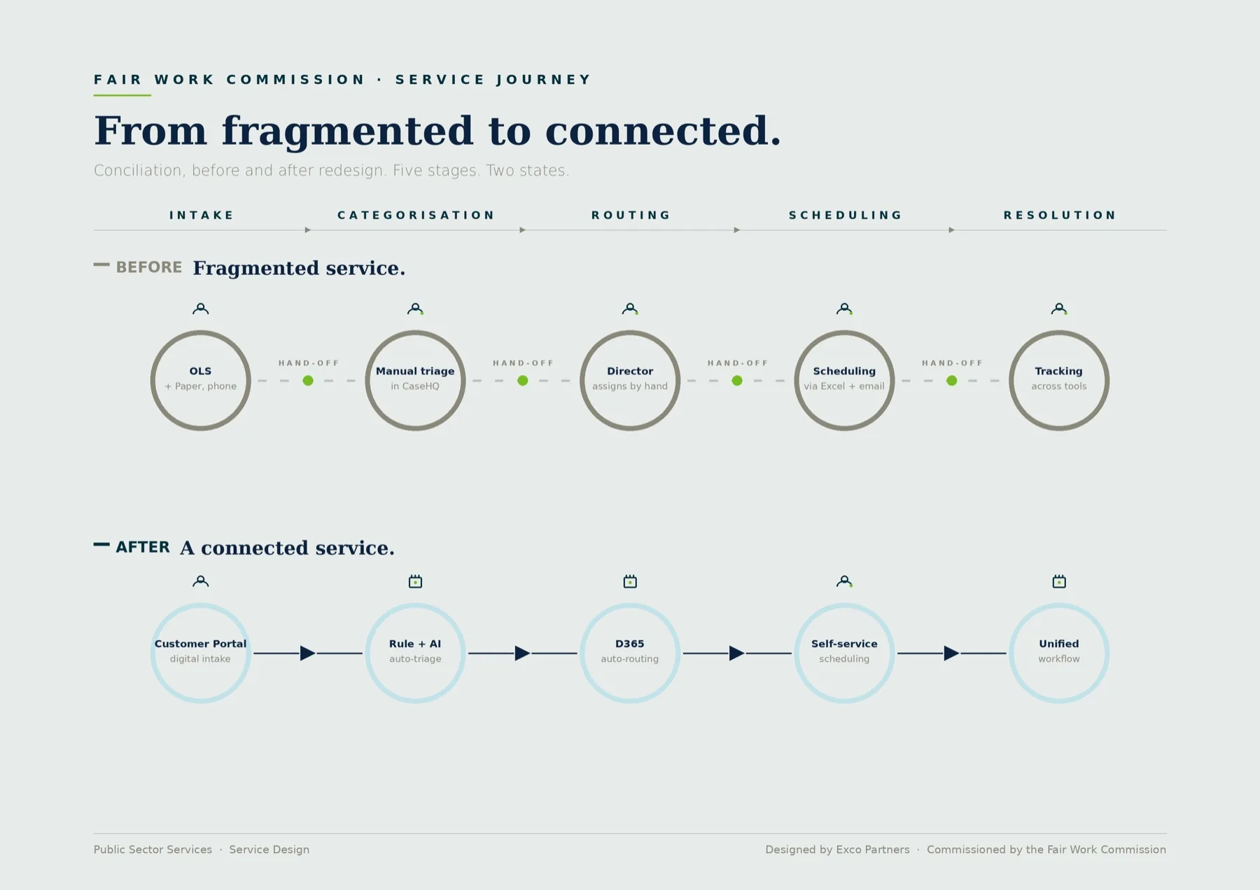
And the detailed service blueprint the delivery teams built from: the same five stages, mapped screen by screen.
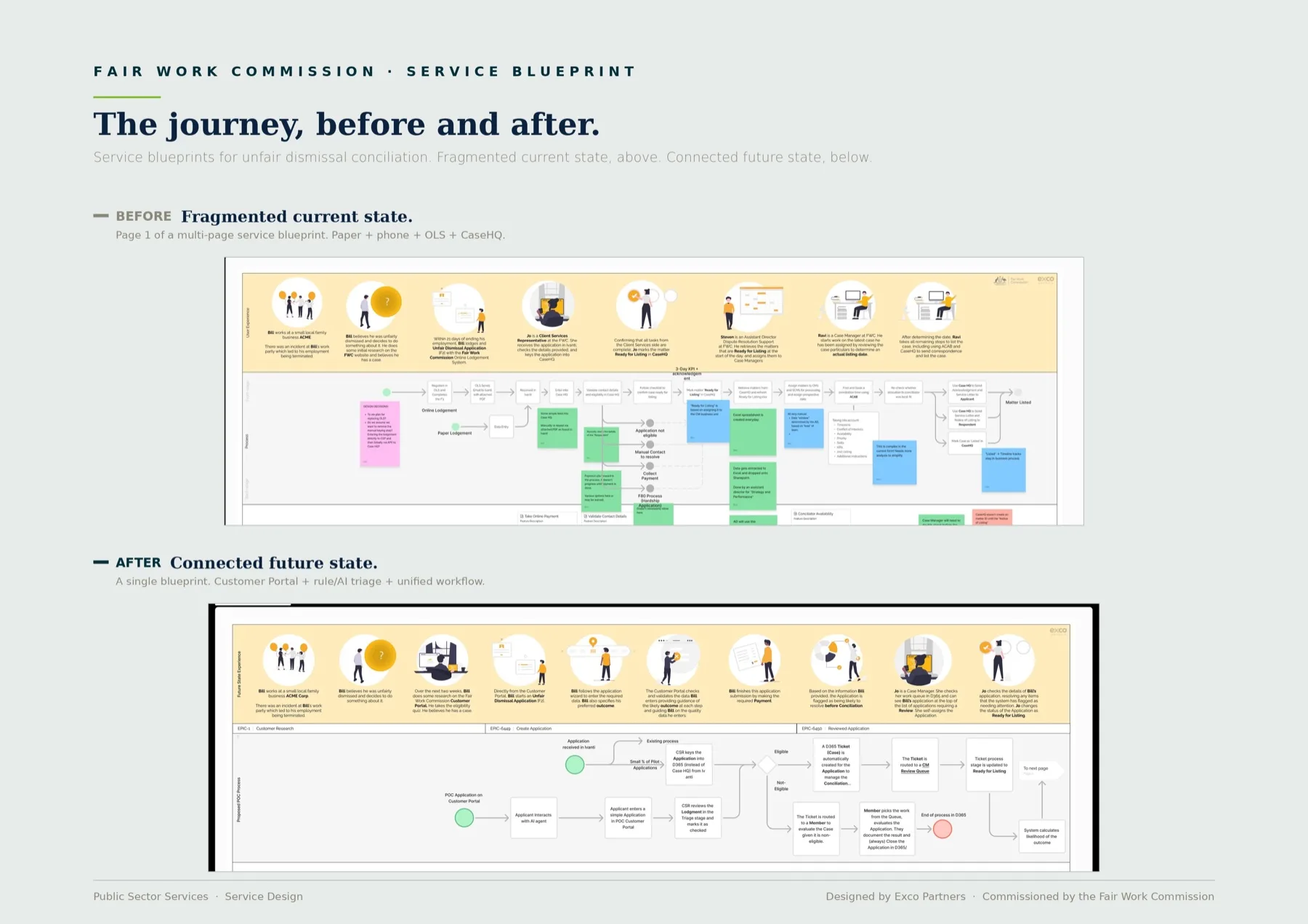
In text: the fragmented current state runs on paper, phone, the old lodgment service and CaseHQ; the connected future state runs a single blueprint on a customer portal with rule-and-AI triage and one workflow.
When you're the only designer, every decision is yours to defend, so the evidence has to be airtight.